Payment terminal design

Overview
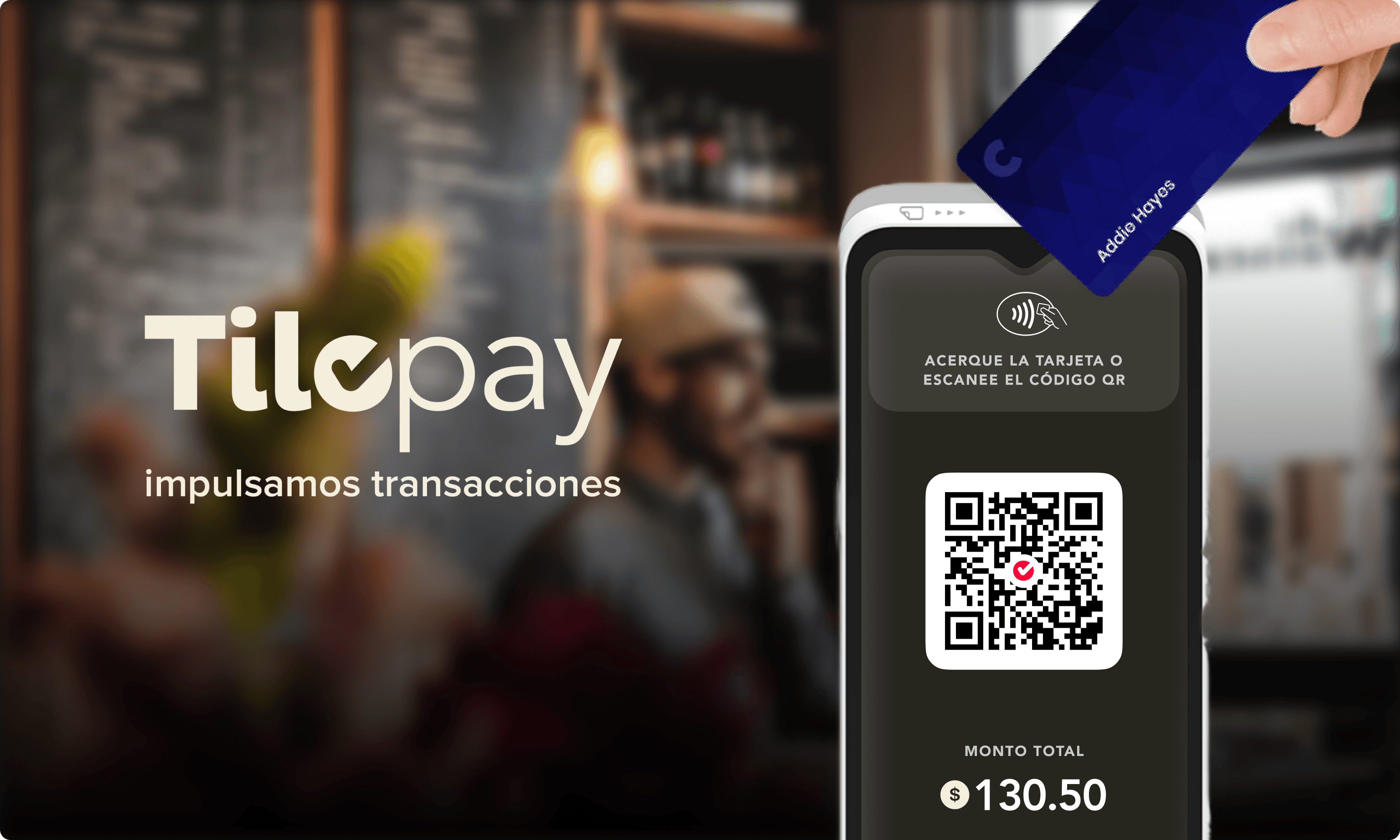
Designed a tap-and-QR payment terminal for a Costa Rican fintech, covering the full cashier flow from amount entry to receipt delivery.

My role
Sole designer on the product. Owned the flow, the system, and the visual language end-to-end.

Key decisions
One job per screen, one primary action per screen. Oversized typography — the amount is the screen. A warm cream-and-red palette designed to feel friendly rather than transactional. A keypad sized for thumbs, not fingertips. A type system that survives amounts from $0.00 to ¢138,650,106.08 without flinching.

Outcome
Shipped v1.0.1 in production, currency-flexible (CRC + USD), supporting tap, QR, and receipt-by-WhatsApp-or-email from a single flow.